Train ticket booking redesign
Amtrak is a passenger rail service in the United States, offering intercity travel across a vast network of routes. Focusing on providing comfortable and efficient transport, Amtrak connects communities and promotes rail as a reliable travel option.
Role
Sole product designer
Timeframe
65 hours
Year
2024

Challenge & background
The challenge was to redesign a mobile first responsive booking flow within 65 hours.
Travel experiences start with booking a means of transport. A prominent issue amongst competitors is that the booking process on many inter-city train sites is often convoluted to navigate and it can be challenging to choose the best fare option. Booking a train ticket shouldn't feel like navigating a maze.
What's the problem?
New Amtrak users have trouble quickly evaluating and comparing their train ticket options to find the best solution for their travel needs.

The design process

Problem Discovery

Ideate & Prototype

Test & Iterate
.jpg)
01 Problem Discovery
Research goal
I needed to understand travelers' primary goals in the train booking process, areas of frustration, and how they impact their travel plans.
What I needed to know
-
Identify the key factors that influence traveler’s decisions in the booking process
-
Determine how travelers navigate the booking process to achieve their goals
-
Determine traveler’s primary pain points and areas of frustration in the train booking process
-
Establish what factors contribute to abandoning the booking process altogether
Research method
Research was conducted through user interviews with 4 participants to get a personal sense of a learner’s goals, needs, and frustrations.
What was learned?
Amtrak users have difficulty comparing their train and fare options when booking and becomes overwhelming when there are many train options to choose from.

Comparing fare options
Users find it challenging to quickly evaluate and compare their fare options, especially as new users.

Challenge finding a fair deal
Comparing prices to get the best deal for their needs is a challenge for cost-conscious travelers.
Why is this an issue?
Due to the unfamiliarity of the service, this can lead to user frustration and missed opportunities for successful bookings.
What's the current flow like?
The current site doesn’t provide the most pleasant experience as expressed by users. These are some of the design elements that needed work.

Contextualizing the user
One persona was developed from patterns discovered in user interviews - The Novice Train User. Although my research primarily identified patterns relating to users who are new to train travel, it was important to consider the needs of more experienced users.

POV: A user’s perspective
As a new Amtrak user, it’s difficult to quickly evaluate my train options so I can choose the right one for my travel needs.

How can we make it easier for new Amtrak users to purchase a ticket, that meets their budget and travel needs?
02 Ideate & Prototype
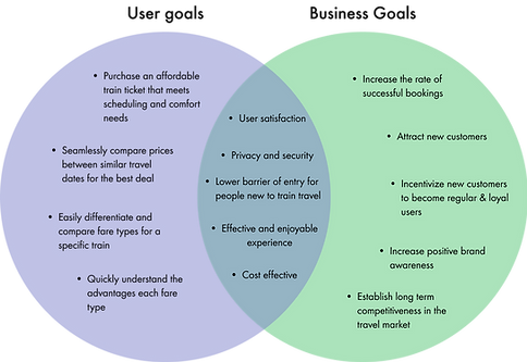
Prioritizing goals
A venn diagram allowed me to take a step back and evaluate user goals and business goals before formulating any solution .
User flow
Once the project priorities were determined, I started with defining the user flow of the train booking process.


Sketching user flows
Low-fidelity wireframes were first created through sketches for quick idea exploration. Defining the user flow was my main consideration and the UI language was starting to take shape.


Going digital
Mid-fidelity wireframes were developed in tandem with the developing user flow.

So what changed?
Current design
New design

Reducing cognitive load
The required input fields for a train search are now presented to the user one at a time on a new page to reduce cognitive load.
Price comparison
Users now have the ability to compare their price options between similar dates allowing for a more flexible and convenient search.
Current design
New desgin

Current design
New design

Fare selection
Users are no longer “pressured” to choose a fare without comparing them first. Users can also compare between business and coach fares without switching tabs.

03 Test & Iterate
Usability test objectives
-
Identify any difficulties users have in evaluating their train and fare options.
-
Determine if the updated train ticket purchase experience meets user expectations.
-
Identify any frustrations and confusion users have when searching, browsing, and checking out.
-
Identity navigation & usability issues for further improvement.
Test parameters
Test type
Unmoderated usability study
Participant count
4
Location
Remote and in-person
Duration
10-15 minutes
What were the positives?
It was a successful test and presented evidence to support the changes made. Comparing train price options became a lot quicker, users feel more in control of their fare choice , and UI changes facilitated quick decision-making
What needed improvement?
Not everything aligned with users' needs and desires. Based on feedback from usability testing, I implemented key changes before progressing to the high-fidelity design phase.
Before usability test
After usability test

Comparing fares
The fare selection page needed iteration as users had difficulty quickly comparing their options. This would present a major problem for travelers on the go.
Confusion at checkout
Users did not expect to exit the checkout page when clicking “back” to make sure the trip information is correct. This needed to change to prevent the loss of potential bookings.
Before usability test
After usability test

Another round of testing
A high-fidelity prototype test was conducted using the same parameters, and participants as the first test to see how they responded to the iterations made since their last use.
"Final" iteration
The users had a positive response to the proposed solutions for the major issues identified during the mid-fidelity test.
After some minor modifications based on some user feedback, a “final” prototype was created.

Responsive design
As a mobile-first product, I prioritized the mobile experience but always considered other screen sizes throughout the design process.

Selecting departing train
Conclusion
Impact
Users had a positive experience with the new booking process and expressed the extra convenience it brings to new Amtrak users on the go.
A great travel experience begins with the logistics, like booking a train ticket. With a seamless first booking experience, a foundation is made for a great trip and will encourage new Amtrak users to rely on the service for their future travel plans.
Personal takeaways
Finding the right balance of information needed for new and returning users to buy their desired train tickets was my main challenge in this project. The current Amtrak site was discovered to be a little overwhelming and difficult to read for a new user. On the other hand, returning users developed an understanding of how the Amtrak service works and only needed quick glances to make decisions.
I was often unsure whether some information was necessary at a certain point in the user flow and how to show that information to users. User testing of course helped me clarify the doubts and questions I had. This helped me learn a little more about how new users process and interpret information during a task, as opposed to returning users, which will help me immensely going forward.
What’s next?
-
Explore the need for a train route guide while booking as some Amtrak users expressed a use for this during user interviews.

.jpg)